
Clearing the Clutter
A City Website’s UX Overhaul
This course project focused on redesigning a mobile website for the City of Fairfield and its diverse audience.
The project challenge was improving the information architecture and modernizing an outdated site.
We aimed to solve this by reorganizing the website’s structure, simplifying navigation, and using a mobile-first design approach.
Throughout this project, I developed expertise in user research, evaluative methods, information architecture, and wireframing.
+42%
improvement in first-click test task success between the original website and the proposed prototype
Time for Class
In 2023, I pitched my local government's website for a course project aimed at revamping information-heavy websites into user-friendly mobile layouts. At the time, I saw it as an opportunity to improve this vital resource for residents, businesses, and visitors.
As a key contributor in a team of four graduate students, I wore many hats: setting project timelines, facilitating team meetings, establishing testing procedures, analyzing data, and leading the creation of high-fidelity wireframes. My goal was to enhance the the City of Fairfield website's usability and create a mobile-first prototype that truly served the community.
ROLE: UX Researcher & Designer DURATION: 8 weeks TOOLS: Figma, Optimal Workshop, Zoom, Google Suite
ROLE: UX Researcher & Designer DURATION: 8 weeks TOOLS: Figma, Optimal Workshop, Zoom, Google Suite


Original Website
Defining the Problem
Our initial assessment of the City of Fairfield website painted a grim picture: the website’s navigation was convoluted, with duplicated links, unclear processes, and an overall lack of usability. Likewise, the mobile experience had poor integration of micro-sites, missing filters, and inconsistent branding. These significant design and usability issues impeded users from finding the information they need, resulting in frustration.
How could we create a digital space that was intuitive, efficient, and welcoming? This question drove every decision we made as we dove into the project.

As I reviewed the website’s navigation, I wondered
“Who has time to review over 30 pages in order to find what they’re looking for?”
The problem was clear.
The website’s content was like a knotted up ball of yarn, and my job was to untangle it.
To help tackle this, I established three high-level goals for my team.
Assess the website’s content and organization.
Conduct testing and propose new sitemap.
Build mobile-first high-fidelity wireframes.
Mapping the Chaos
Before we could build a better website, we needed to understand what we were working with. That meant auditing the existing content, analyzing how users naturally categorize information, and developing a structure that aligned with their mental models.
Diving into the Problem
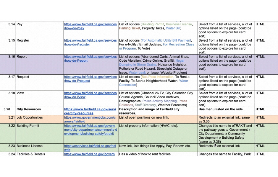
The City of Fairfield website had grown into a sprawling maze of redundant pages, outdated content, and unclear navigation. To get a clear picture, I built a detailed content inventory, mapping out every page and its purpose. This helped highlight inconsistencies and redundancies, setting the stage for a smarter reorganization.

The 'Services' section is overwhelming!
Conducting Card Sort Testing
To untangle the existing website’s complex navigation, we conducted multiple rounds of open and closed card sorts to clarify terminology, simplify categories, and improve usability. Alongside this process, we also conducted a brief pilot and contextual inquiry exercise to gather additional insights.
Key insights from our 16 total participants included the importance of clear terminology, the value of providing an “Unsure” category to pinpoint areas of confusion, and the need for continued refinement.

Round 1
Open card sort with 100 cards, ~6 categories, and 4 participants
Found that “Services” became a catch-all category
Inconsistent terminology led to some confusion
Round 2
Closed card sort with 57 cards, 8 categories, and 3 participants
Users struggled with terms like “Dwelling Unit”
“City Departments” was also difficult to categorize
Round 3
Closed card sort with 40 cards, 7 categories, and 9 participants
User feedback helped refine and clarify difficult terms
Following user-driven patterns improved accuracy
Structuring for Success
With a cleaner information structure taking shape, we needed to validate that our decisions made sense for real users. We developed user personas to guide our approach, brainstormed key tasks, and ran multiple rounds of tree testing to fine-tune the navigation.
Meeting Our Users
Who uses the City of Fairfield website, and what do they need? I created two personas—one representing a city resident and another for business owners—to ground our design decisions. These personas helped us prioritize essential site features and craft testing tasks that reflect real-world needs.

.png)
Diego is a passionate restaurant owner living in Fairfield, CA. He uses the city's website in order to stay up-to-date with all his necessary business permits and licenses.
Pain Points:
-
Lack of clarity in the renewal process of the business license
-
Time-consuming paperwork and confusing requirements
-
Fear of missing the renewal deadline and facing legal consequences
Needs:
-
Simple and clear instructions for applying for support
-
Detailed eligibility guidelines to understand qualification criteria
-
Easily accessible information about the types of support available
Local Business Owner
How might we consolidate scattered information in order to guide business owners through the renewal process and its paperwork seamlessly?
Optimizing Navigation
To assess how intuitive our proposed sitemap was, we ran tree tests with 13 total participants, asking them to complete key tasks like paying a utility bill or finding business permits.
.png)
.png)
After analyzing results from two rounds of testing, I restructured navigation, ultimately improving direct success rates by 19% and reducing task failure by 7%.
.png)
Having multiple subcategories led to difficulties with navigation.
Participants had trouble with wordy and difficult task prompts.
Tasks that included verbs like “pay” were often associated with “Services.”
Test Findings
Edit categories to focus their scope and eliminate excess subcategories.
Update tree test task scenarios and prompts to improve clarity.
Design Fixes
Rename action-based pages to better reflect their parent category.
Finalizing Information Architecture
Based on insights from the card sort testing and tree testing, I finalized the sitemap to ensure it prioritized task-based actions, aligned with user mental models, and streamlined navigation. This new structure transformed the website into a more intuitive, user-friendly experience.

Crafting a Seamless Experience
With a well-defined structure in place, it was time to visualize how users would interact with the redesigned website. We moved from low-fidelity concepts to refined wireframes, testing along the way to ensure an intuitive experience.
Setting the Foundation
To quickly explore layout ideas, I created low-fidelity wireframes that focused on core functionality (specifically the business license renewal process) and content placement. These early drafts allowed us to iterate rapidly before refining details in higher-fidelity designs.


Testing First Impressions
To measure how well users could navigate our design, I ran first-click tests on the mid-fidelity home page. With a 92% average success rate, the results confirmed that our menu structure was intuitive, requiring only minor refinements.
“I usually don't click on the small arrow because that's too much effort… so instead I click the entire word itself.” - First-Click Test Participant

Bringing It All Together
After weeks of research, testing, and iteration, we arrived at a streamlined, user-friendly prototype that better serves Fairfield’s residents, business owners, and visitors. This redesign wasn’t just about improving a website—it was about making information easier to find and empowering users to navigate their local government with confidence.
Meeting Our Goals
The final prototype transformed the City of Fairfield’s outdated, confusing website into a user-friendly, mobile-first experience. By restructuring the site’s navigation, prioritizing key user tasks, and refining the visual hierarchy, we created a more intuitive and accessible digital space.

A fresh start!
Our redesign makes finding information easy and navigating the site a breeze.
Reflecting on the Process
Looking back, this project challenged me to untangle a complex website, rethink its information architecture, and develop a clear content strategy—all while centering real user needs.
Although this prototype remained a course project, the experience deepened my expertise in user research, usability testing, and content organization, reinforcing my passion for crafting intuitive digital experiences.
You made it to the end — thank you!
If you’re looking for someone who can happily get lost in user research and bring findings to life through design, please reach out. Let’s work on something great together!